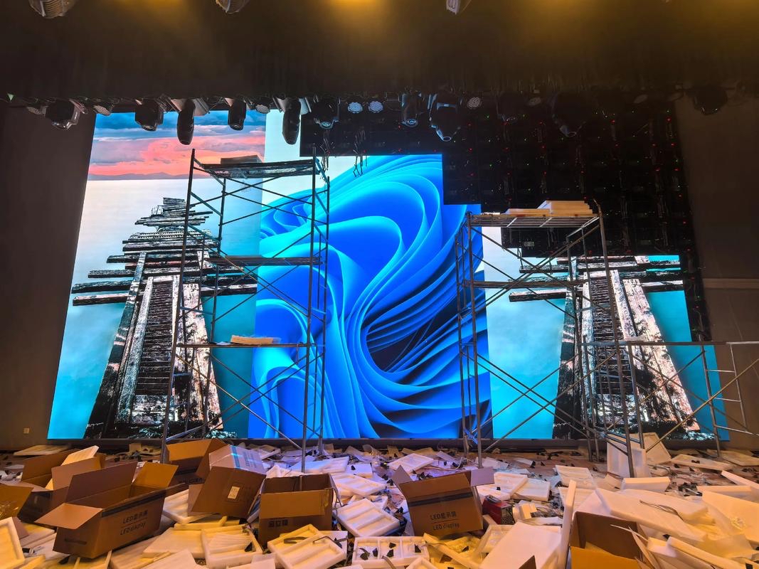
Retail spaces compete for attention, and static print loses that competition the moment a shopper looks at a phone. LED digital signage costs more up front than a poster frame, but it changes content in seconds, runs promotions on a schedule, and turns a window into a moving brand statement that no printed sheet can match.
The shift is not only about motion. A bright LED display reads clearly in daylight, where printed vinyl in a window often looks dull behind reflections. The display also lifts the perceived quality of the store, because a sharp screen signals investment in the same way that good lighting and clean floors do.
This guide covers the practical decisions a retailer faces: matching pitch to the store layout, choosing brightness for window and interior positions, planning content that sells rather than merely decorates, and measuring whether the screen earned its place in the fit-out budget.
It is written for store owners, brand managers, and fit-out teams who need a display that survives years of daily operation in a busy retail environment, not a one-off installation for a launch event.
A store that runs a screen well also gains a second benefit: the display becomes a merchandising tool that the staff can control. A promotion that arrives from head office in the morning can be on the window by lunchtime, which keeps the store aligned with a campaign instead of lagging behind it by a printing cycle.
Pitch is chosen from the nearest comfortable viewing point, not the average one. In a window display, shoppers pass within one or two meters, so a fine pitch such as P1.25 to P2.5 keeps text and product close-ups crisp. Deeper inside the store, where the nearest viewer is four meters away, P3 to P4 is usually enough.
Ceiling banners and aisle-end screens are seen from a few meters and often at an angle. A slightly coarser pitch keeps the cost sensible, provided the content uses large type and simple imagery. Fine detail in small text simply disappears at that distance regardless of the pitch chosen.
Consider the shopper path rather than a single viewpoint. A window screen must work for someone walking past at an angle, which affects both the pitch and the viewing angle of the modules. Wide viewing angle cabinets keep color and brightness stable as the shopper moves along the pavement.
Finally, match the screen shape to the space. A wide, shallow ribbon suits a fascia or a shelf header, while a tall portrait screen suits a pillar or a window mullion. Designing to the architecture looks deliberate, and shoppers read deliberate design as premium.
Cabinet dimensions matter as much as pitch when the fit is tight. The screen must divide into whole cabinets that also fit the available opening, and a design that ignores the cabinet size can leave an awkward gap or force a custom build. Confirm the cabinet count and the overall dimensions together before the joinery is ordered.
Where several screens share one space, plan them as a family rather than as separate purchases. A consistent pitch and brightness across the window, the entrance, and the aisle makes the store feel coherent, and it simplifies content production because one master file can be adapted to each canvas instead of being rebuilt from scratch.
| Store Zone | Typical Viewing Distance | Suggested Pitch | Content Style |
|---|---|---|---|
| Window display | 1 - 3 m | P1.25 - P2.5 | Product close-ups, bold text |
| Entrance feature | 2 - 5 m | P2.5 - P4 | Brand loops, current offers |
| Aisle end | 3 - 6 m | P3 - P5 | Price and promotion |
| Shelf header ribbon | 1 - 4 m | P2 - P4 | Category and price tags |
| Ceiling banner | 6 - 15 m | P5 - P10 | Large type, simple motion |
A window display is the hardest retail position, because the screen faces daylight while the shopper looks through reflection. Indoor brightness of 800 to 2500 nits is normally enough, but a south-facing window in summer needs the upper end of that range and a high-contrast panel to stay readable through the glass.
Contrast matters more than raw brightness in many interiors. A screen with deep blacks next to bright product imagery reads as vivid and premium, while a washed-out panel looks flat no matter how bright it is. The CV-PRO indoor COB series reaches a 10000:1 contrast ratio, which keeps black areas genuinely dark under store lighting.
Reflections are a design problem, not a brightness problem. Angling the screen slightly away from the window, or placing it where the shopper sight line avoids a bright background, does more for readability than simply raising the nits. Anti-reflective surface treatments help as well.
Interior screens do not need daylight brightness. Running a screen at full power in a dim store washes out colors and strains eyes, so use the auto-brightness sensor or a schedule to dim the display during trading hours and at night.
Color temperature should be tuned to the store lighting. A screen calibrated for a cool showroom looks blue under warm interior lamps, and a screen tuned too warm looks yellow against daylight in the window. Matching the white point to the nearby light sources makes the screen look like part of the room rather than an obvious installation.
Uniformity across the face is the detail shoppers notice without naming. A bright module beside a dim one shows up against a plain white or black background, which is exactly the content most brands use. Insist on a uniformity check at handover and record the calibration so it can be restored after any module repair.
| Display Position | Main Challenge | Brightness Guidance | Key Spec |
|---|---|---|---|
| Street-facing window | Daylight and reflection | 1500 - 2500 nits | High contrast, wide angle |
| Mall entrance | Mixed light | 1000 - 1500 nits | Stable color, slim cabinet |
| In-store aisle | Ambient ceiling light | 800 - 1200 nits | Even uniformity |
| Fitting room area | Low light, close view | 800 - 1000 nits | Fine pitch, dimming |
| Exterior storefront | Sun and weather | 5000+ nits | IP65, outdoor rated |
Content should answer a shopper question, not simply fill the screen. The strongest retail loops mix brand awareness, a specific offer, and a product close-up, each held long enough to read. A common mistake is a fast sequence of images that moves on before any message has landed.
Dwell time is the metric that matters for a window, and it can be raised by motion that resolves into a clear image rather than constant busy animation. For an interior screen near the point of sale, the useful metric is attention at the shelf, which favours calm, price-led content over pure spectacle.
Sync the screen with the trading day. A morning loop that promotes breakfast, a lunchtime peak, and an evening offer ties the investment to real sales patterns. Scheduling content by daypart costs nothing technically and makes the display feel current to regular shoppers.
Measure before and after. Compare footfall, conversion, or basket value over a baseline period, and change one variable at a time. A screen that is judged only on how it looks is hard to defend at budget time, while one that is tied to a measured lift earns its place.
Keep the library small enough to stay fresh. Ten strong clips that rotate across the week outperform a hundred files that nobody manages, and a small library is easier to update when a price or a season changes. Archive content that has run its course so the playlist never carries stale offers.
Legibility is the quiet constraint behind every good retail loop. Type should be large enough to read at the worst viewing position, not the best, and contrast between text and background should survive the brightest hour of the day. Test the loop on site at the real distance before it goes live, because a design that reads well on a monitor can fail at three meters in daylight.
Asia Vision Technology supplies indoor LED displays for retail windows, entrances, and in-store features. The CV-PRO COB series reaches a 10000:1 contrast ratio with refresh above 3840 Hz, which keeps product imagery vivid and camera-friendly under store lighting, and the pitch range P0.9 to P20 covers both fine-pitch windows and larger fascia screens.
Outdoor storefronts can use the D-PRO series, rated IP65 with brightness above 8000 nits. All products carry CE, FCC, and RoHS certification, ship in fifteen to twenty working days, and carry a three-year standard warranty with a rated life of 100,000 hours.
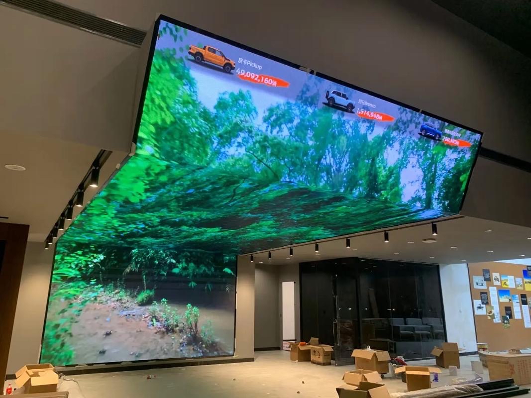
For this requirement our range covers it directly: the RH-PRO fine-pitch COB (flagship, full redundancy) and the COB CV-PRO series (Ultra-HD fine pitch).
Related reading: Retail digital signage sourcing for Australia
Related reading: UK Retail Digital Signage Guide for Store Teams 2026